Thursday, 1 October 2015
Start of Year 3 Presentation
NOTES:
Slide 1: Brief intro, where I was at the end of year 2
Slide 2: Where I am now, let people know what projects I'm doing
Slide 3: Where do I want to be? why do I want these things? Time frame?
Slide 4: keeping myself immersed in design stops me procrastinating and losing touch with design, internships will boost networking and skills in industry, PPE will also do this
Slide 5: Personal Branding, I will be updating this as my style has moved on- talk about what my style is currently and ideas for new branding
Slide 6: Favourite publications - I would love to work at these companies for the networking opportunities, but mainly to be involved in graphic design projects that I love and can learn from
Slide 7: More of the same, explain how the style differences will give a different learning experience
Slide 8: Go through current research, virus analogy and any issues i'm currently having- can't get hold of old pomo magazines
Slide 9: Strong work from last year, this is the minimum quality that I will expect from myself from now on- I must keep up this work ethic.
Slide 10: Same as 9
Slide 11: planned briefs, why do I want to do each one of these? what will I learn? how will my skills improve?
Tuesday, 29 September 2015
Context: YOU
We were set a 1 day brief about myself and the things which influence me as a designer outside of design. I always struggle with briefs like this as I'm still properly discovering myself as a designer and as a person. After talking to Declan Bell my course mate, I decided that I would talk about my analytical and logical approach to tasks. I also wanted to try convey the the evolution my work has taken, from traditional design, to more modern/post-modern styles. I then chose to do this with somewhat of an art piece rather than a piece of design, with my wooden chess board, which represents my logical methodology and traditional personality. I then set up White in the Stonewall Attack (A generally classic structure, representing my early interest in classical design), and I set up Black in a developed Grünfeld Defence (a hypermodern structure, representing my later interest in post-modern newer design).
We were also set the task of writing a 12word rationale for the work we produced.
'A physical representation of my logical process and development into post-modernist design'
We were also set the task of writing a 12word rationale for the work we produced.
'A physical representation of my logical process and development into post-modernist design'
Wednesday, 1 April 2015
Personal Branding
Sharanya Kunneth


Mohamed Achraf


Lee Marcus


Leonardo Gubbioni

Roberto Melendrez

Lu La


Kigo Kitchen

Sofia Fauve


Tuesday, 24 February 2015
Movie Posters Suck.
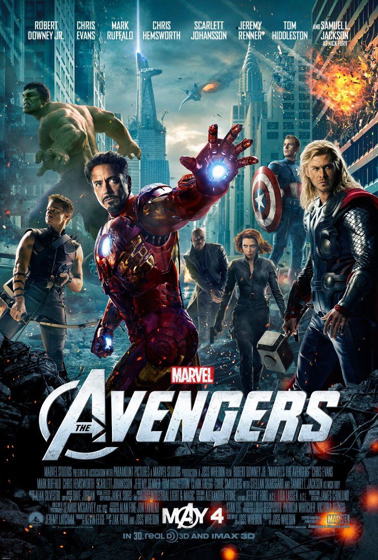
Movies have always been a huge part of my life. I use them for entertainment, relaxation, education and procrastination. Something that is really starting to irritate me about movies however is the posters. The companies such as Miramax, MGM and 20th Century Fox pump millions into the films, so why are the posters so bland and generic? Take the Marvel franchise for example. Birthed from illustration and art, you would expect that above any other franchise the films they produce would be beautifully crafted, as well as the promotional products. Yet this is what they deliver for what may be the biggest film of the year:
 It's almost impressive how generic and cliched they managed to make this poster, and I feel like it's almost insulting to fans of the franchise who actually were fans of the comic books themselves. It shows us characters we've already seen, posing in the same pose they always do, with a dark damaged backdrop which can be found on 99% of action film posters. To illustrate how little effort has been put into the poster, here is the artwork for the first installment in the Avengers film series:
 The word 'Avengers' is in a different colour, hardly groundbreaking. Thor and Hawkeye have their weapons raised in the new poster rather than relaxed, the action must be even more extreme! And yet neither poster tells me anything about the story except who it stars. The only new thing about the new film is that there is a new villain (apart from a few new supporting characters), and yet he's the one character that isn't there.
During a year 1 brief where we were tasked with creating an alternative movie poster for a random Bruce Willis film, I came across many obstacles, the main one being realizing who your target audience was so you could cater your design towards them. With these films being so huge, and having an audience which pretty much encapsulates everyone, they have tried to create a poster which does the same. Yet in their mission to create a poster which captivates everyone, they've succeeded only in creating a poster which captivates no-one at all.
During a year 1 brief where we were tasked with creating an alternative movie poster for a random Bruce Willis film, I came across many obstacles, the main one being realizing who your target audience was so you could cater your design towards them. With these films being so huge, and having an audience which pretty much encapsulates everyone, they have tried to create a poster which does the same. Yet in their mission to create a poster which captivates everyone, they've succeeded only in creating a poster which captivates no-one at all.
Wednesday, 18 February 2015


Subscribe to:
Comments (Atom)